Hahn Australia Cup
Branding | Art Direction | Environmental Design
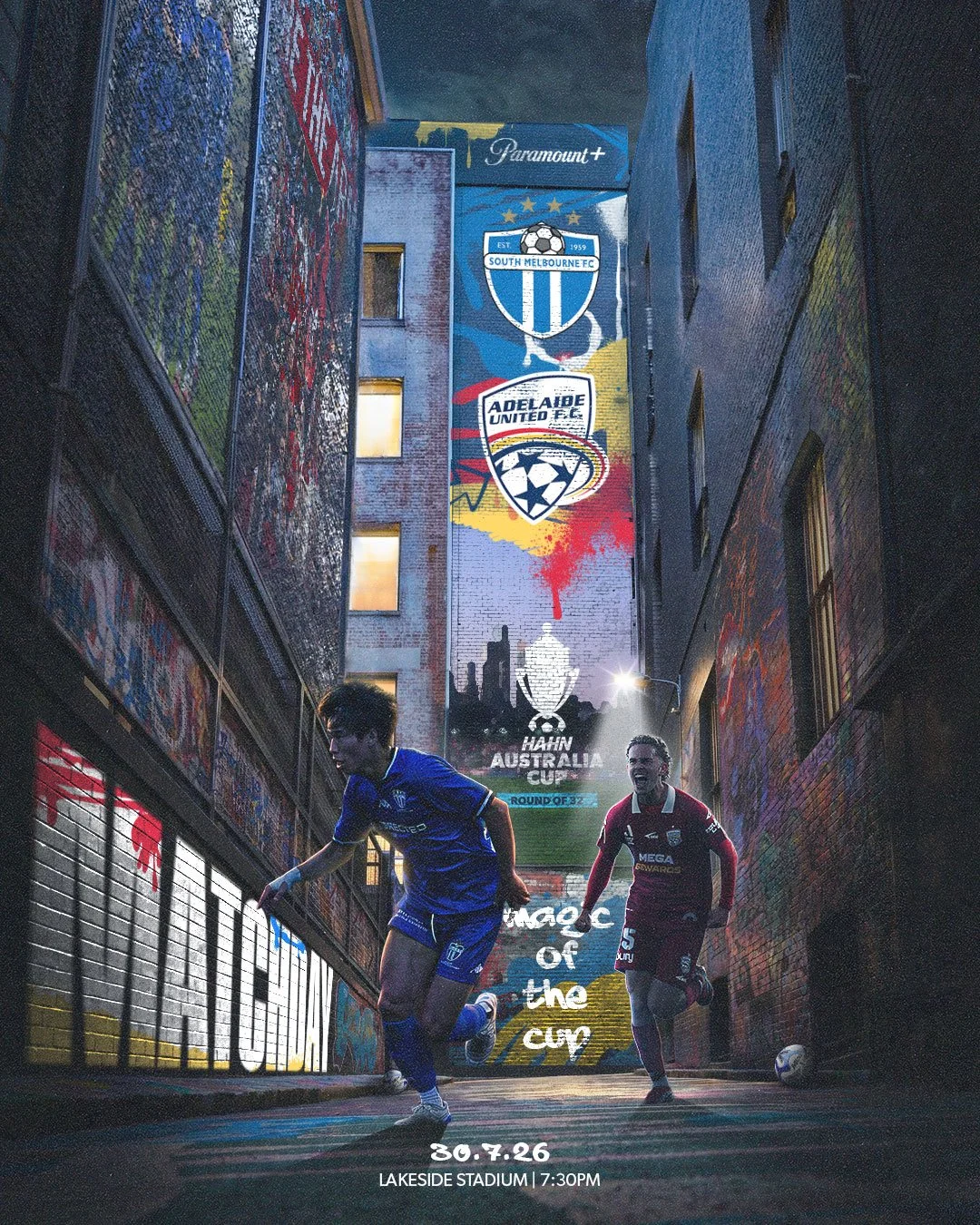
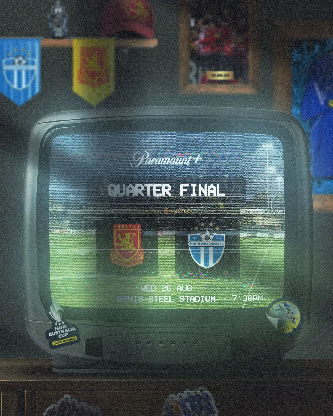
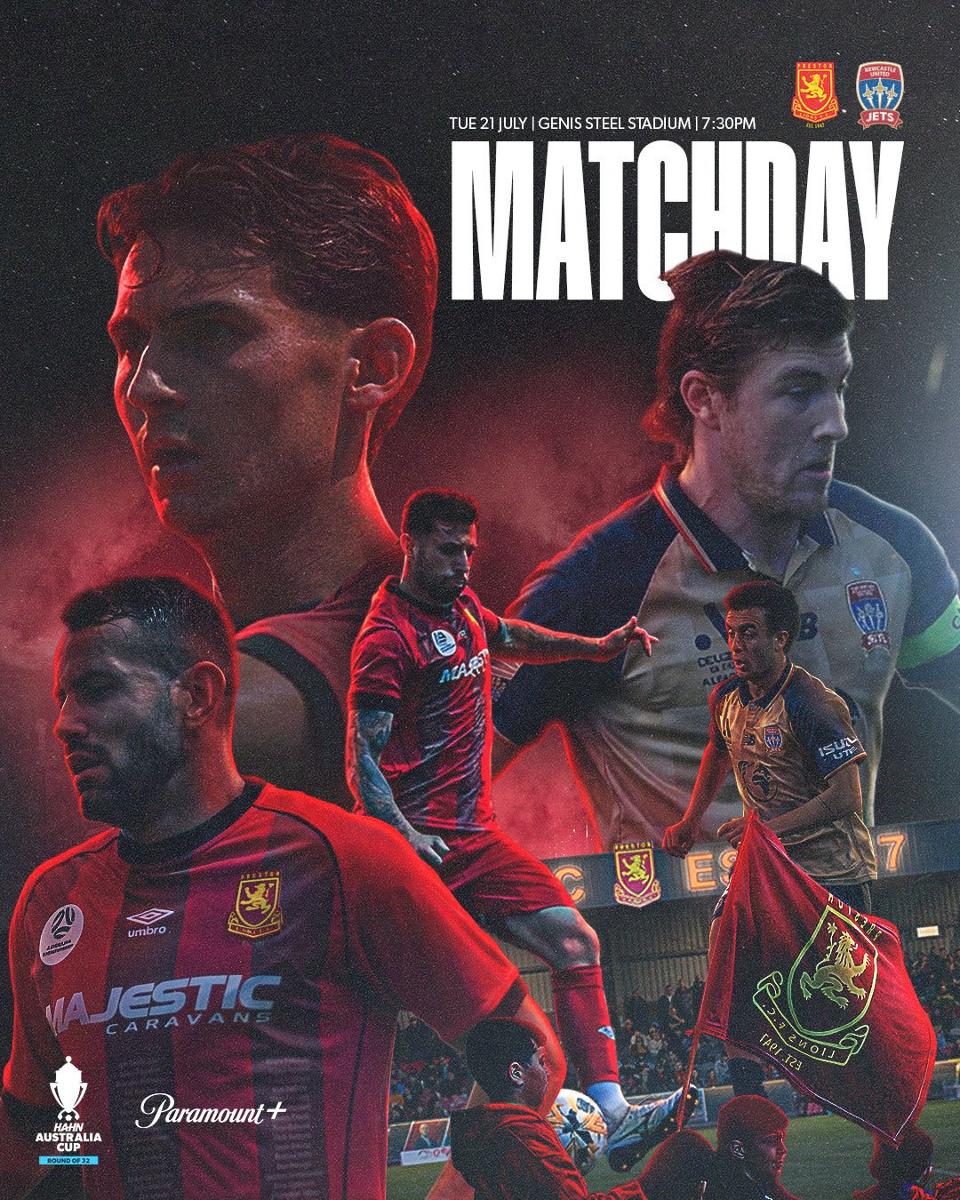
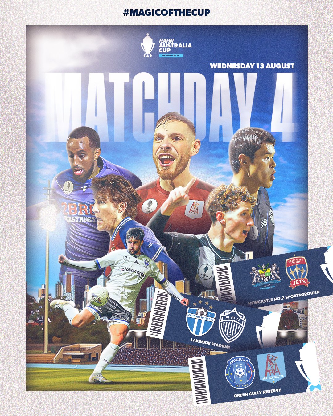
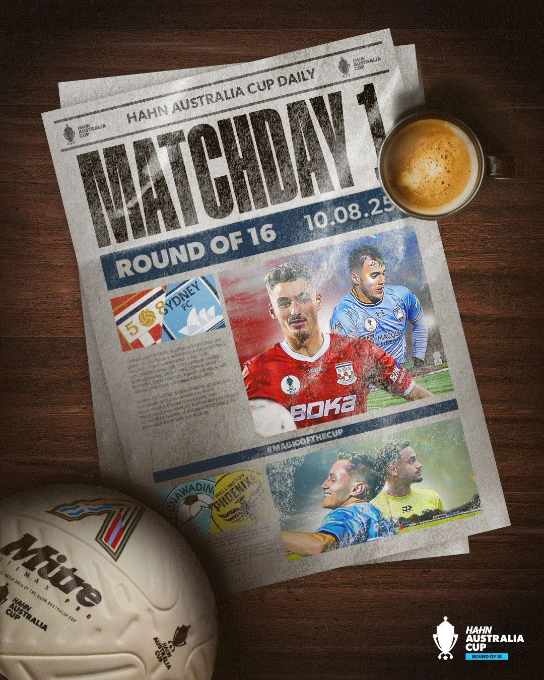
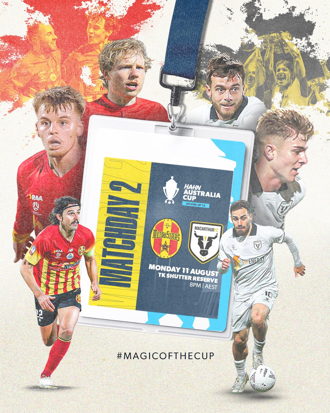
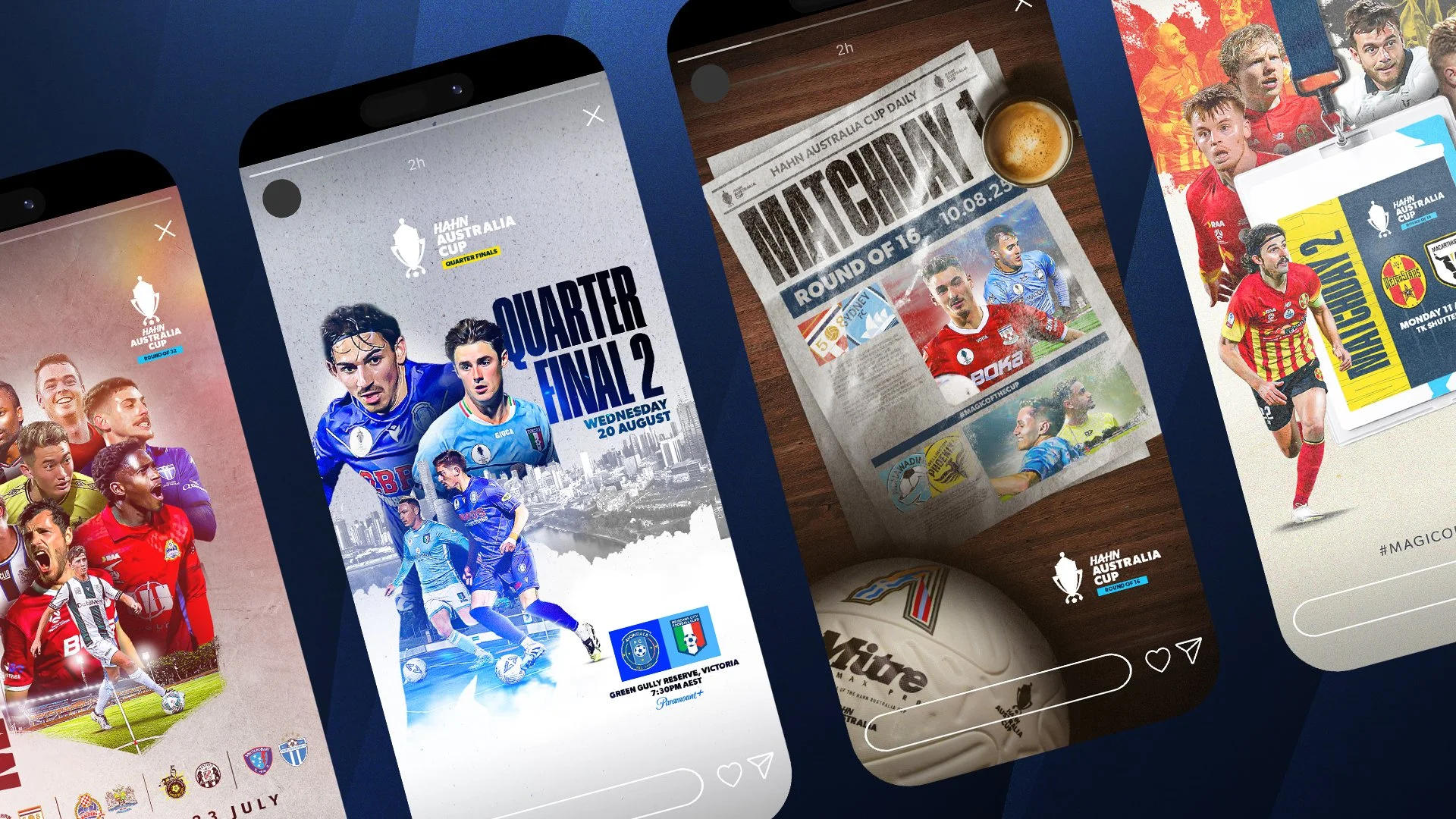
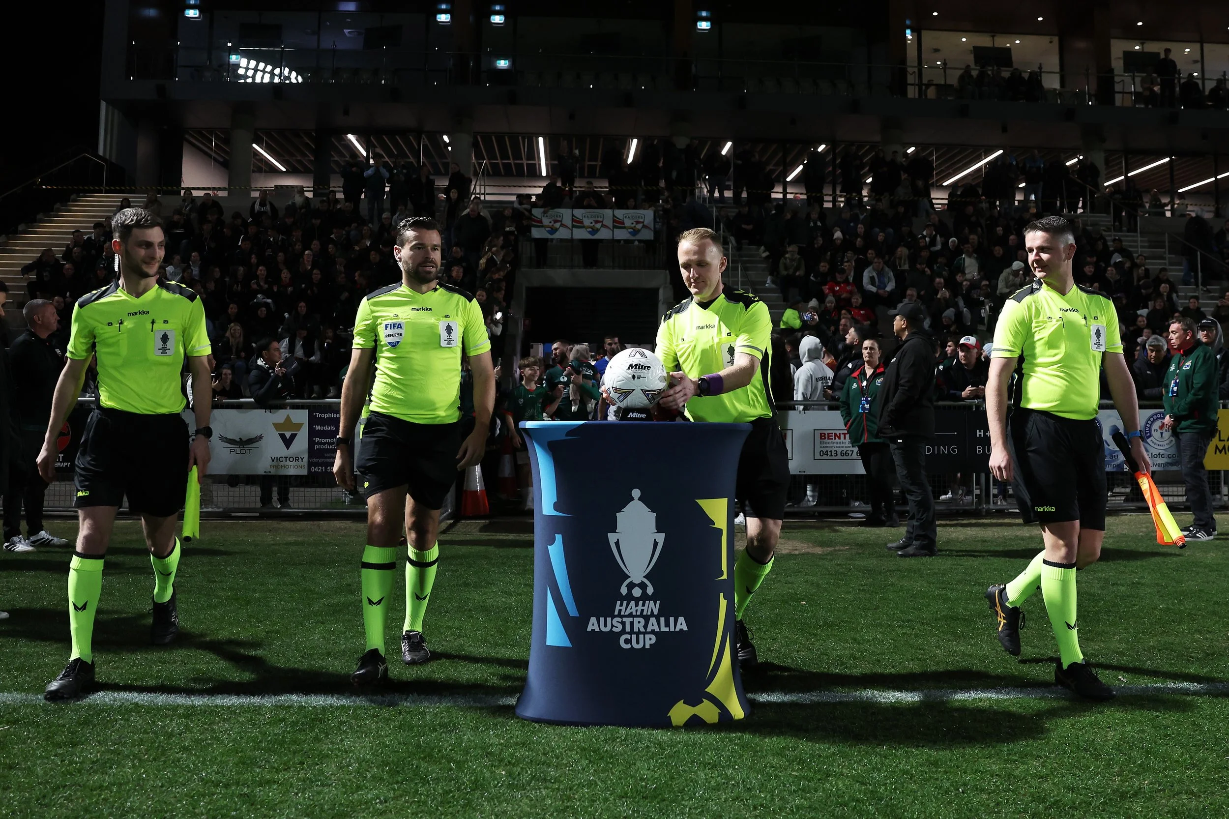
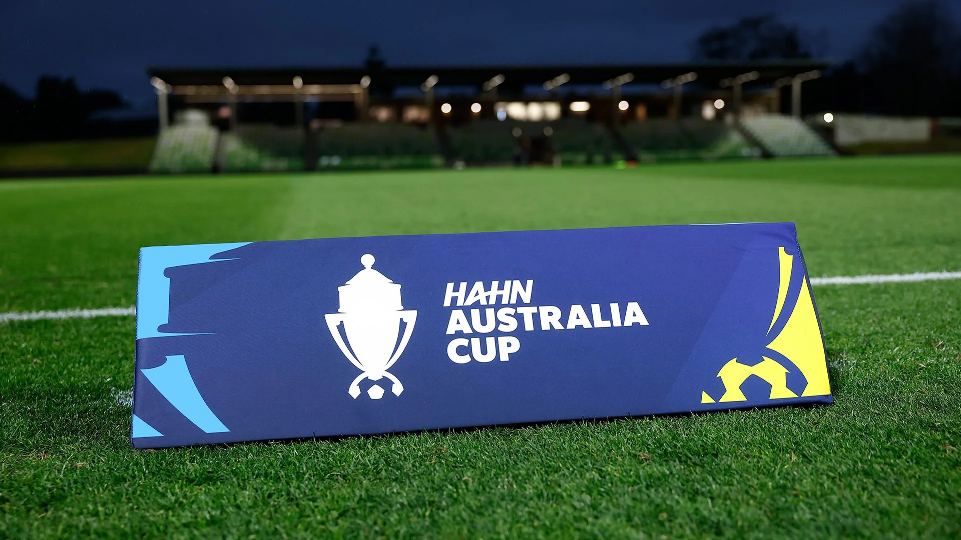
I led the visual strategy for the Hahn Australia Cup asset suite, devising a modular design system that scaled across 700+ clubs. My primary objective was to drive tournament engagement through a tiered visual hierarchy that clearly differentiated competition stages. By prioritising functional communication and brand visibility, I delivered a cohesive ecosystem of assets that empowered local clubs to amplify their presence, ultimately increasing collective engagement across the nation’s largest football competition.
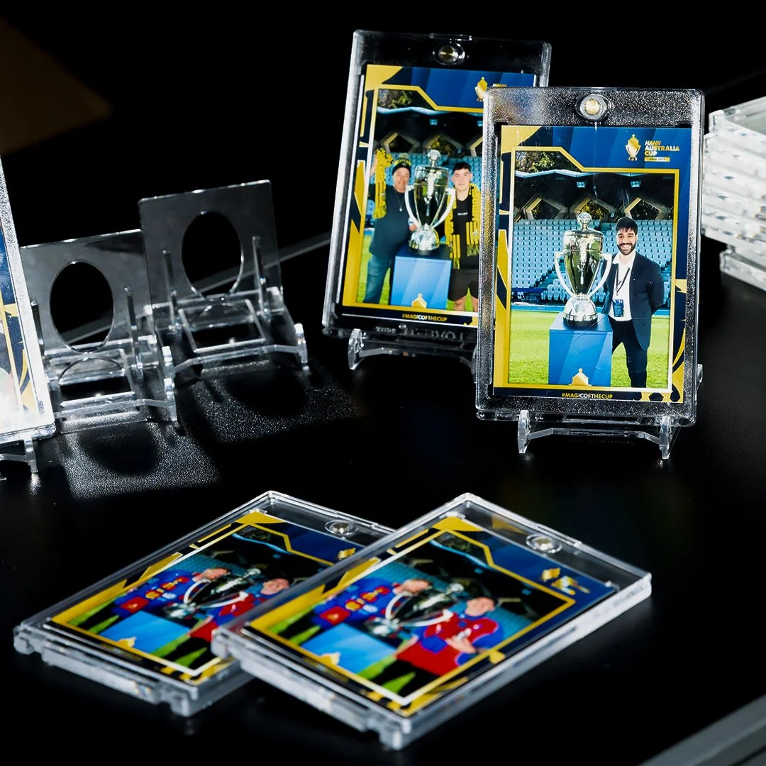
Final
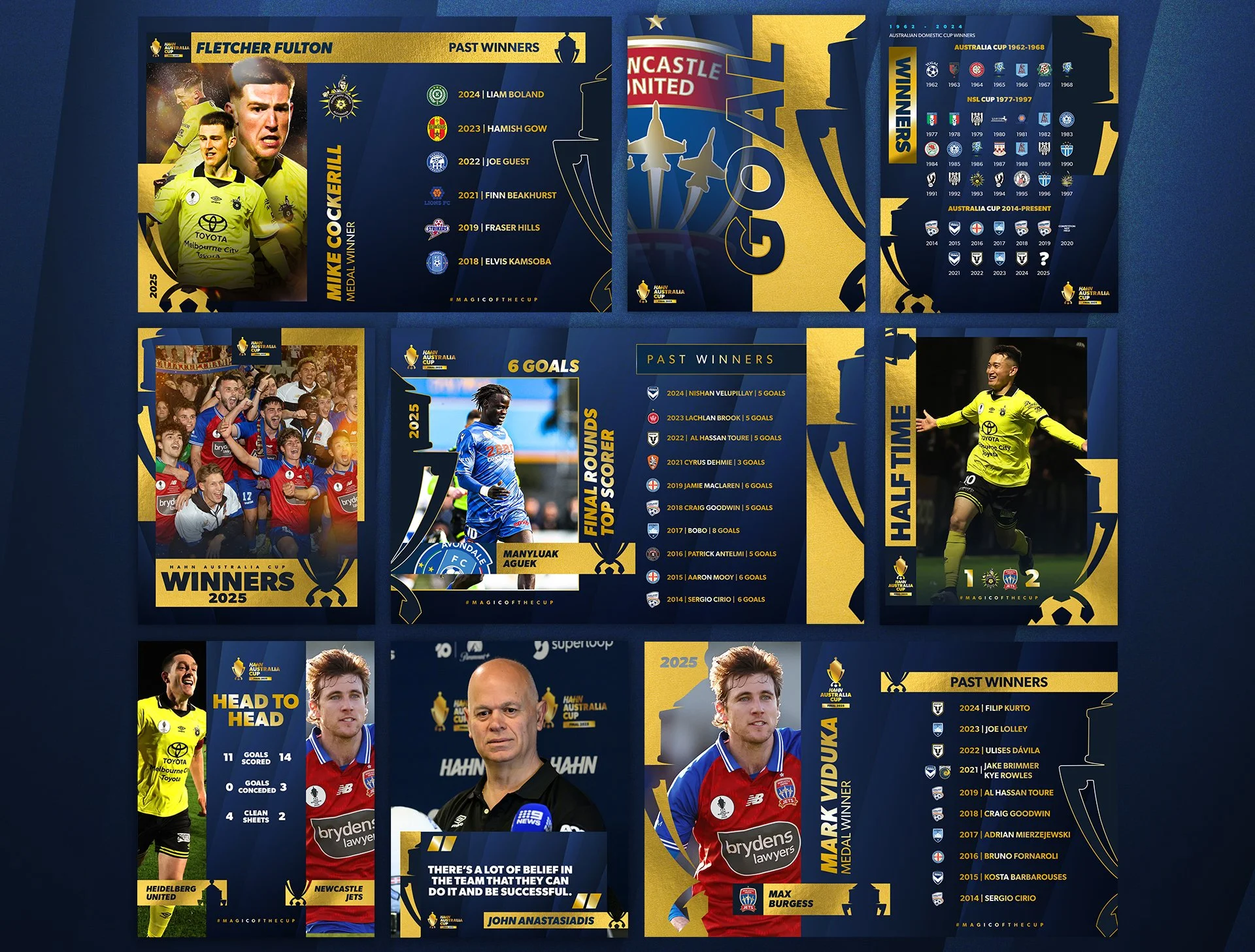
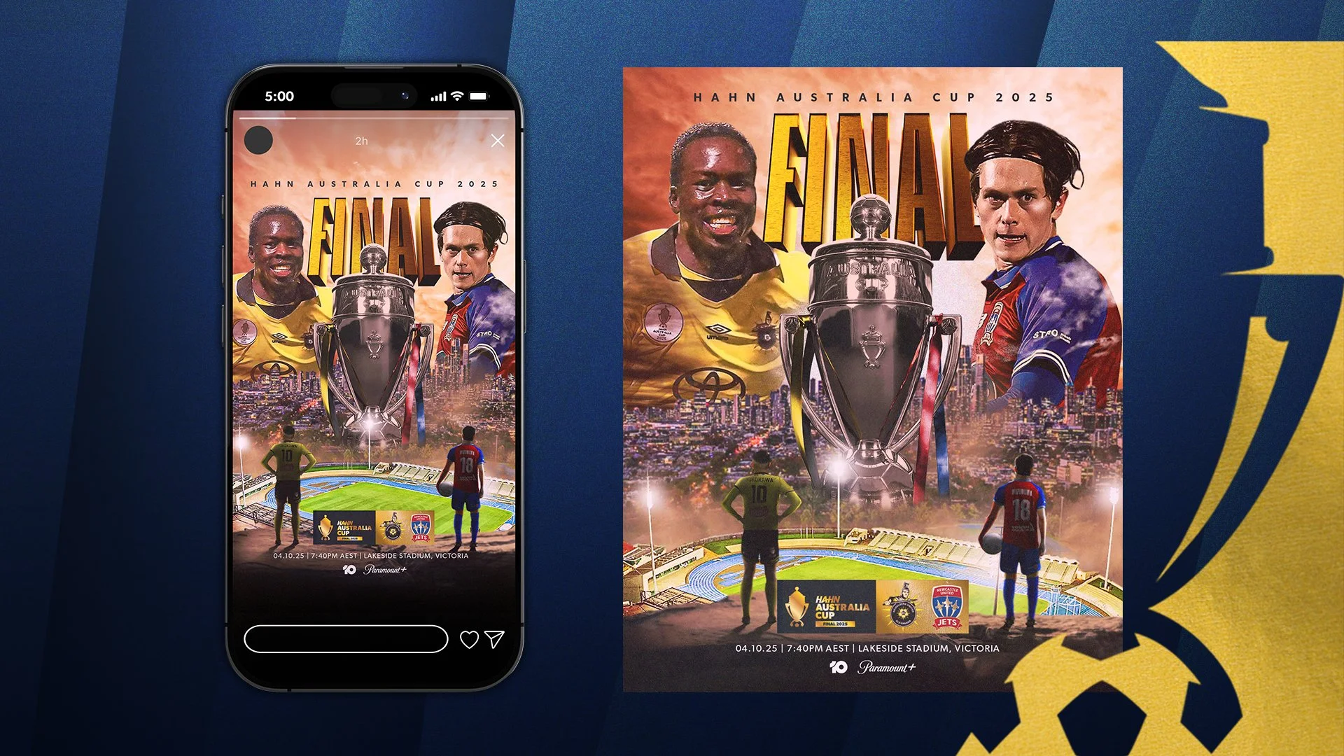
The gold application was used for the final to demonstrate the exclusivity and prestige.
Knockout Stages
The pop blue and yellow were utilised specifically for Round of 32 to the Semi-Finals.
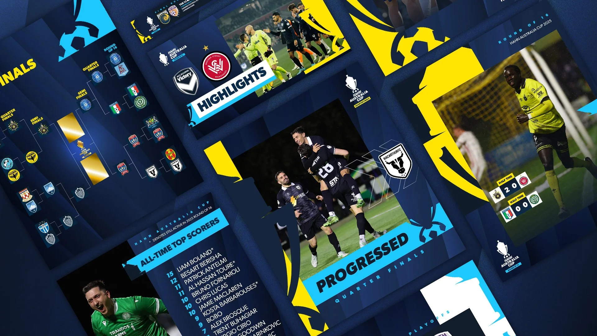
Matchday Graphics